Author Archives: Sara

The Upstairs Bathroom Remodel – Part 2 of 2

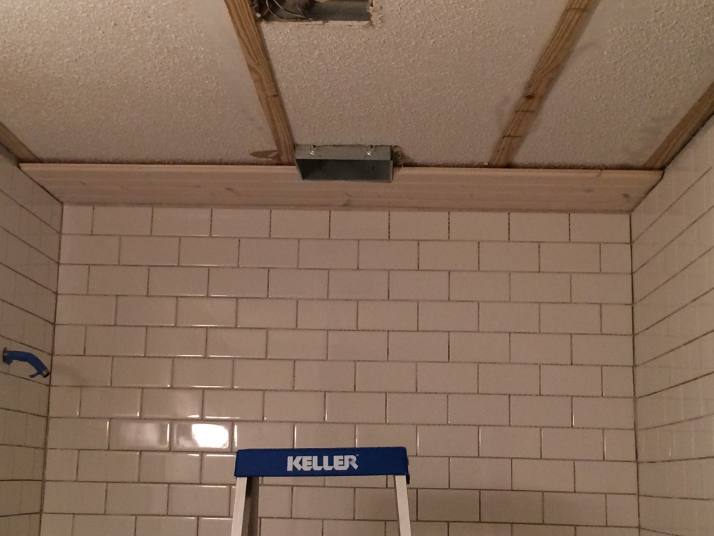
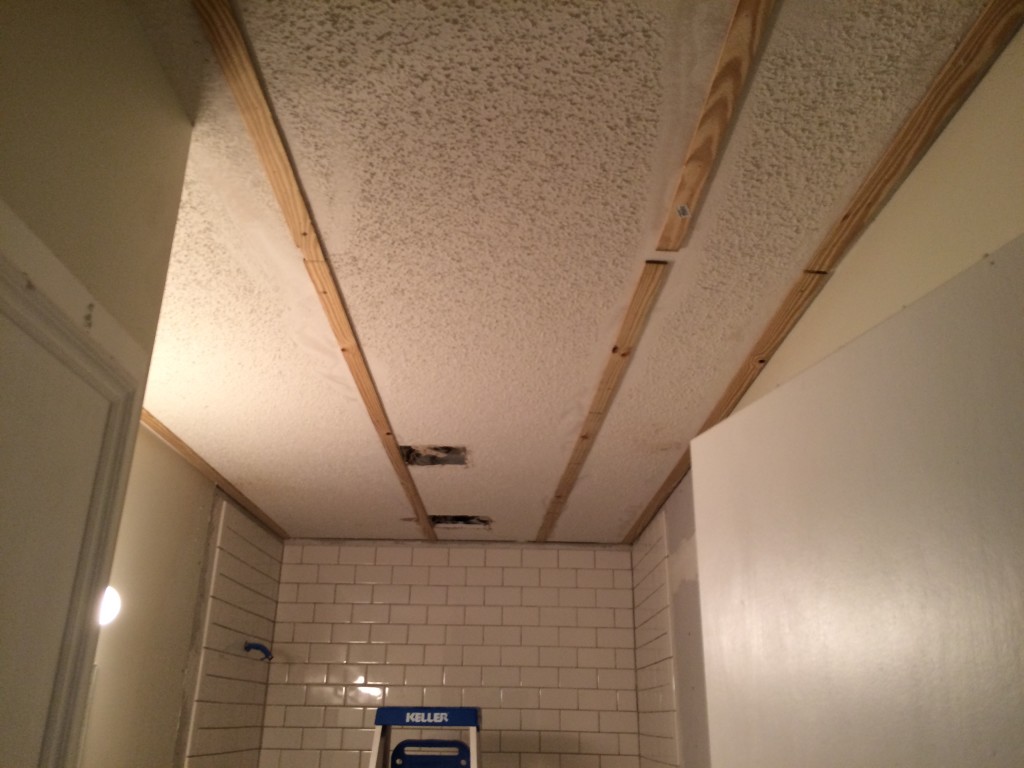
With the shower tiles in place, the next task was working on the ceiling.  We are not fans of popcorn ceilings and wanted to go with wood panels.  To avoid having to scrape off all of the popcorn, I simply scraped lines and attached wood slats.  I would use those slats as supports for the new ceiling panels.

IMG_2247

Notice, there is also a hole cut for a new ceiling fan in the shower.

The new ceiling fan was not the most fun home improvement project I have ever tackled.  To install it, I had to cut a new hole in the ceiling, climb into the attic, rewire the new fan, move the exhaust pipe and seal it all up afterward.  This was late June and even though Minnesota summers are mild, attics are HOT!  I think I lost 2 pounds in sweat up there (note to self: never install an at-home sauna – just go sit in the attic).  Along with physically moving the fan in the attic, I needed to install a GFCI circuit breaker to meet code, because the fan would be in the shower.

IMG_2253

The housing for the new fan is in place, and ceiling boards are starting to surround it.

I used trim screws to attach the boards to the ceiling, carefully hiding each screw in the notches between boards so they would not be visible later.  After all of the boards were in place, I painted them to cover up any imperfections.

IMG_2268

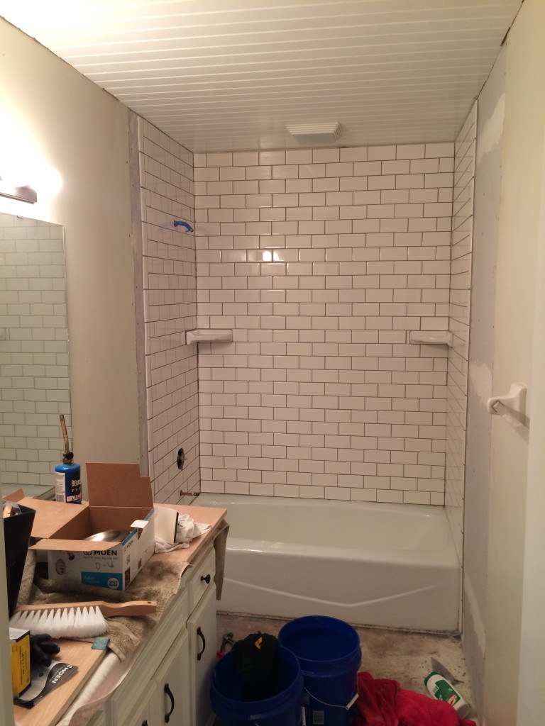
With the ceiling in place, and the shower tiles finished, it was time to start on the floor.

Now that the shower and ceiling were finished, I turned my attention to the floor.  The first step was to lay down 1/4 inch backer board.  This backer board is the same that I used on the walls, just thinner.  It provides a solid base for the tiles.  If you put tiles on wood floor boards, the tiles could crack.  But concrete backer board does not bend the same way that wood does.  After putting down the backer board, I needed to find a pattern that would work for the tiles themselves.  The picture below shows what the floor tiles would have looked like if I had simply laid them out in a simple grid.  Not very nice.

IMG_2269

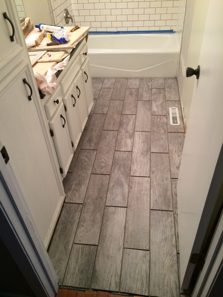
The picture below shows the floor tiles after I have made cuts and placed them in a staggered pattern.  The hardest tile to cut was probably the one with the heat vent in the middle of it.  I bought a diamond blade for my angle grinder to help ease this process along.
IMG_2271

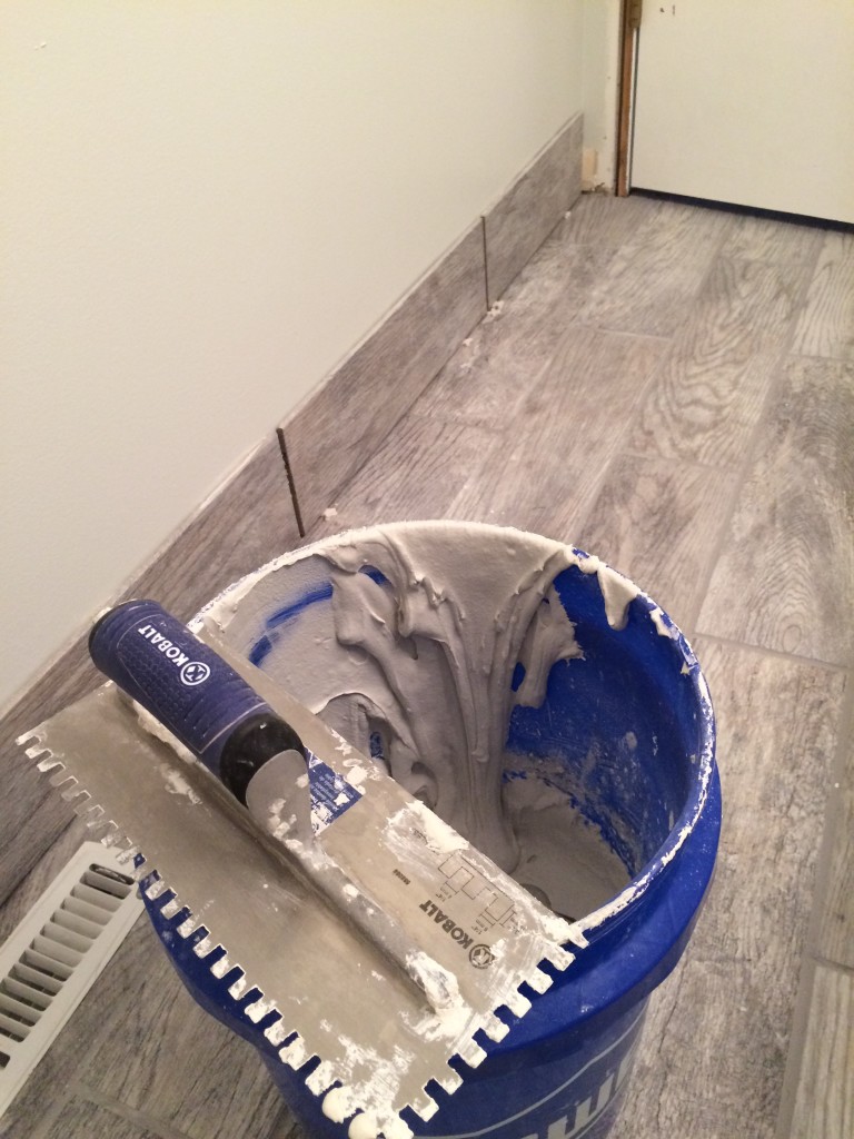
With the floor tiles being much larger than the shower tiles (18″ by 6″ as opposed to 3″ by 6″) I used quarter inch spacers between each of the floor tiles, different from the eighth inch spacers used in the shower.  I used the spacers when loosely placing the tiles, but they are not shown in the photo above.  After using mud to secure the tiles in place (the same mud used on the shower tiles), it was time to start grouting.  The grout fills the gaps between each tile.  I used the same pre-mixed grout from the shower.  Delorean gray.  The pre-mixed costs more than the powder, but you never have to worry about the color being off, or worry about sealing it.
IMG_2295

Shower and floor now grouted, everything is really coming together.IMG_2296
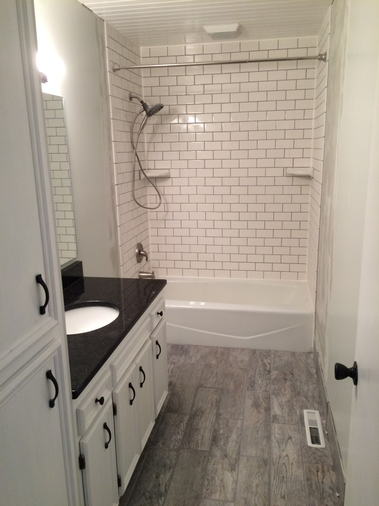
One thing was still missing from the bathroom, re-installing the toilet!
IMG_2299

One thing you do not see in the photo above is the hole I cut, once again using the hole drill described in the first section of this renovation.  I had to cut a hole for the toilet shut-off valve.  IMG_2301
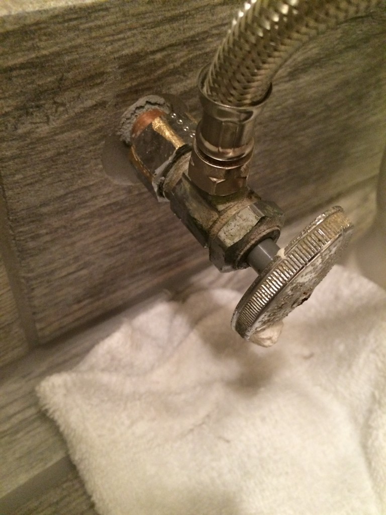
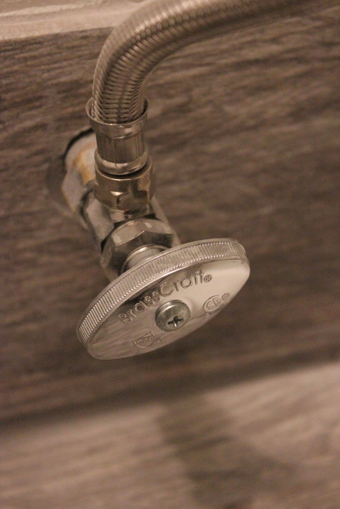
When I installed the toilet, the water shut off valve started to leak.  I figured it was a good time to replace it (since it was also old and dirty).

IMG_3437

Much better!

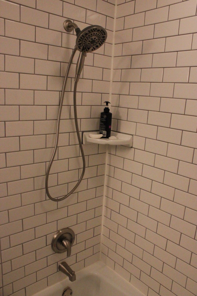
Another finishing touch was installing the fancy new shower head.

IMG_3428

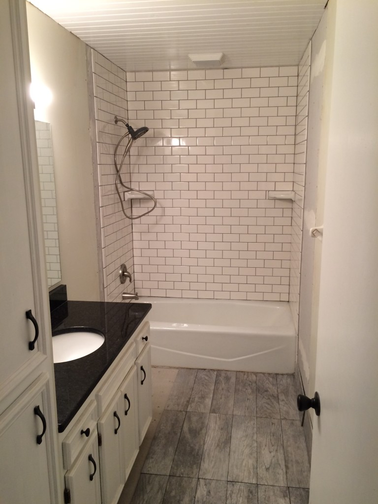
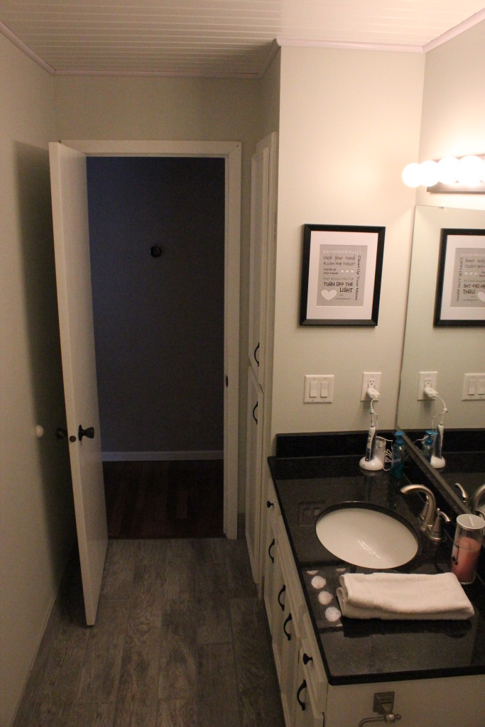
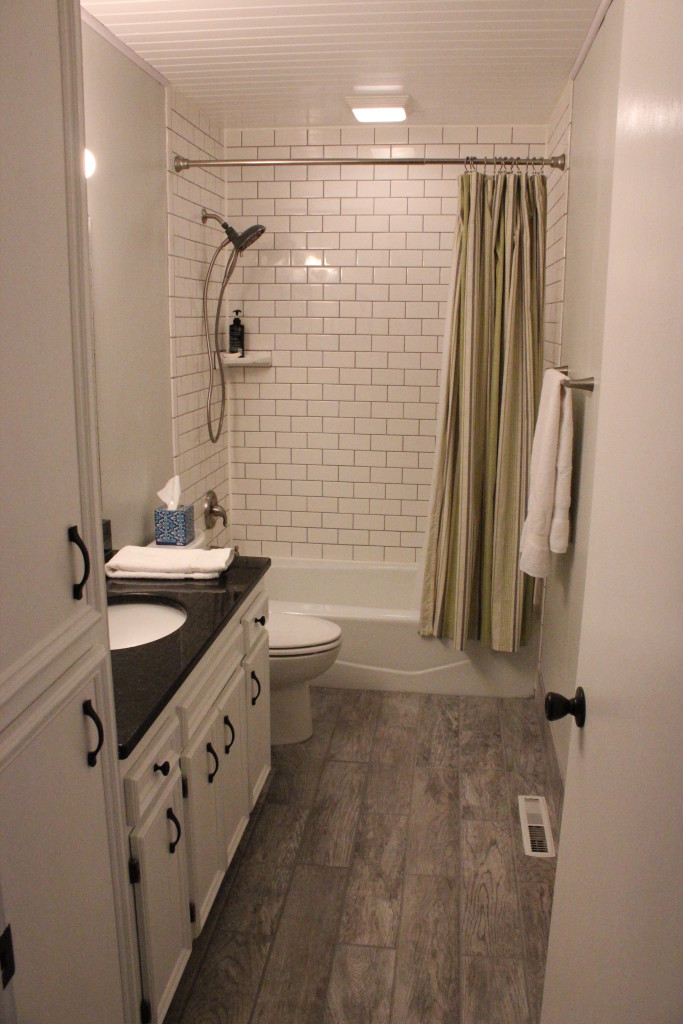
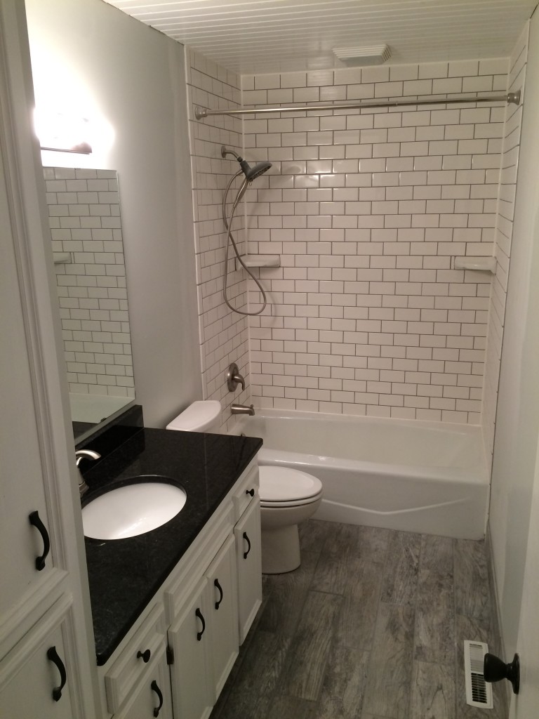
And now the after pictures!
IMG_3429

IMG_3438

Giving this bathroom a face lift was time consuming but completely worth it.  I learned it takes a lot of patience to install tiles, but quickly improved my technique, which should help me down the road.

-Mike
The Banquette

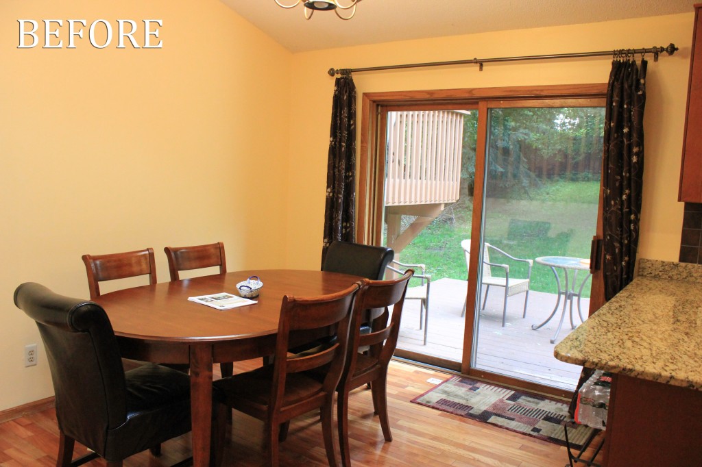
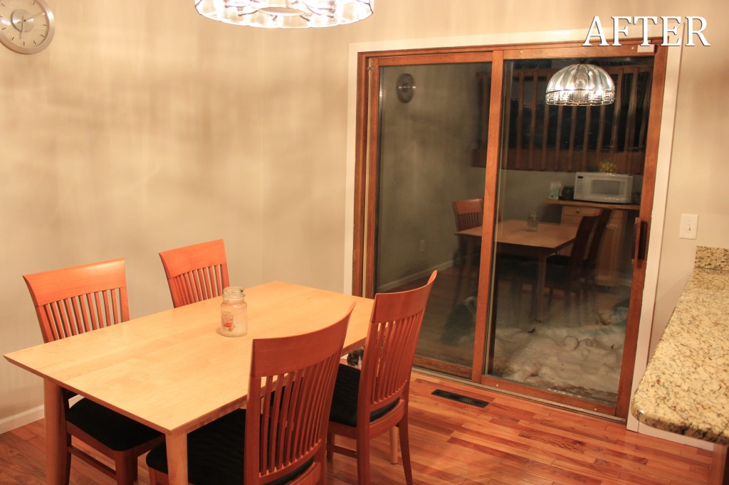
When we purchased this home in August 2013 we immediately struggled with the kitchen layout. While the previous owners had opted for a large dining set in the middle of the room, we felt like this was a cramped setup, and struggled to make the space work with a centered dining table.

9 dining room before

What this image doesn’t show is that when the chairs next to the wall are pulled out, to sit down at the table, they hit the wall. Chair scuffs/wall scuffs galore.

10 dining room after

Again, not a great option, this is actually an Ikea desk that we’ve been using as a dining table since we snagged it from a friend for a great price.

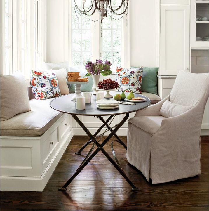
So, the struggle continued, until we finally started searching for better options for the space. Finally a photo on Houzz delivered inspiration.

dream

Ah the dream! Unattainable kitchens all seem to contain white linen and beautiful silk pillows.

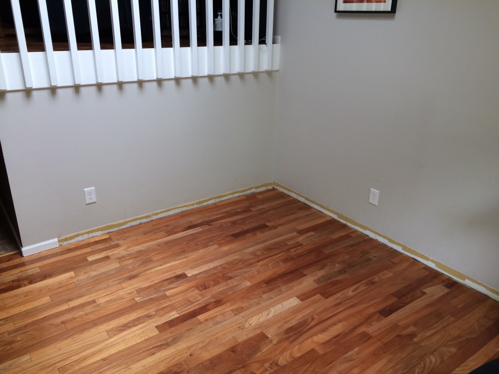
After assessing our space we stared the build by taking off the baseboards.

IMG_2126

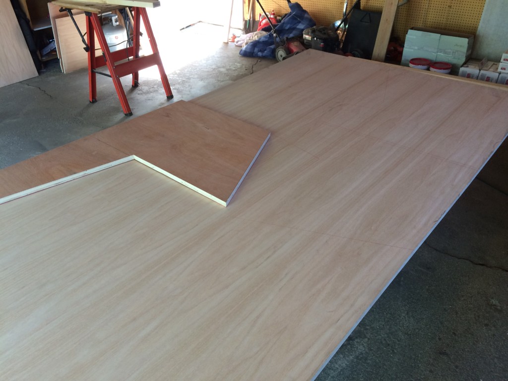
Mike then started building the frame and supports for an idea of how much of the space we wanted the banquette to take. He started by cutting 3/4″ plywood for what would become the major support structures in the banquette.
IMG_2117

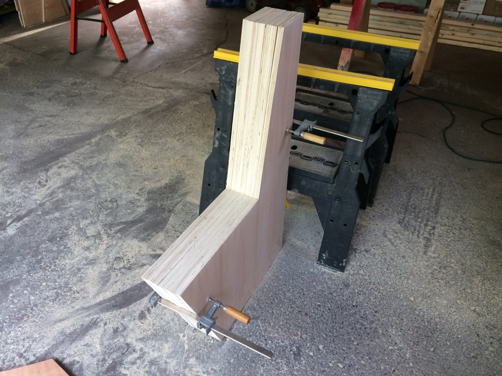
After cutting seven pieces, Mike lined them up and clamped them together.  Using a belt sander, we made sure they were all the same shape.
IMG_2118

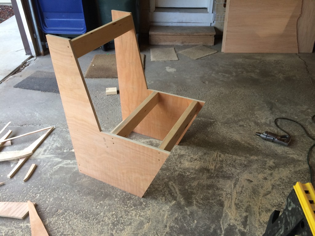
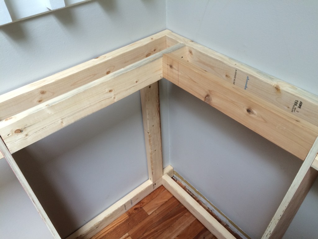
The first segment was a bit of an experiment.  We needed to find a way to use as few 2x4s as possible so that we would have as much interior storage space as possible remain for multiple kitchen uses. We also had to keep the frame sturdy enough for multiple butts and think about what would need to be attached to the seat in later steps (hinges, etc).IMG_2119

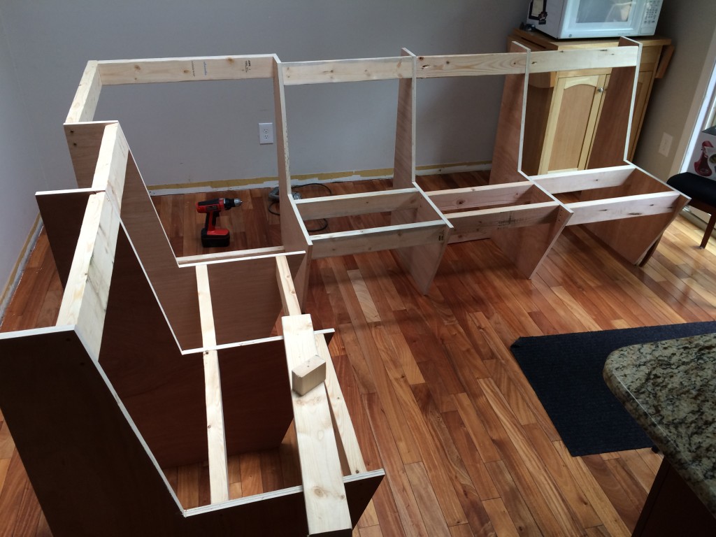
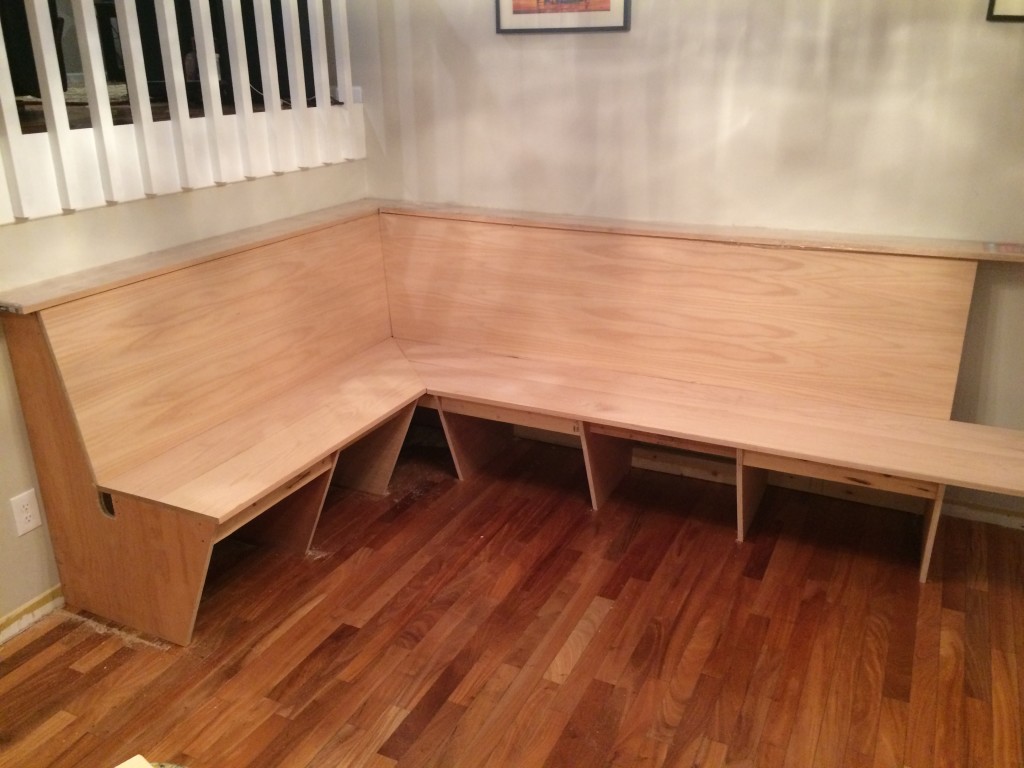
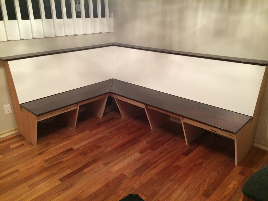
Here you see the skeleton of the banquette starting to take shape in the dining room.

IMG_2125

“How’m I lookin’?”

IMG_2128

Yeah geometry!

Added 2×4 supports to connect the corners together.

IMG_2129

The first compound miter cut! 11 degrees one direction and 11 degrees the other direction. It’s simple over short distance like a 2×4, but wait to see the head-scratcher I was about to run into.

The corner needed angled supports for the seat backs to rest against. IMG_2130

OK, the next series of photos will be dealing with the technical details of how to angle a seating area into an imperfect corner. We understand if you want to jump ahead and just look at the progress photos below (I know I would).

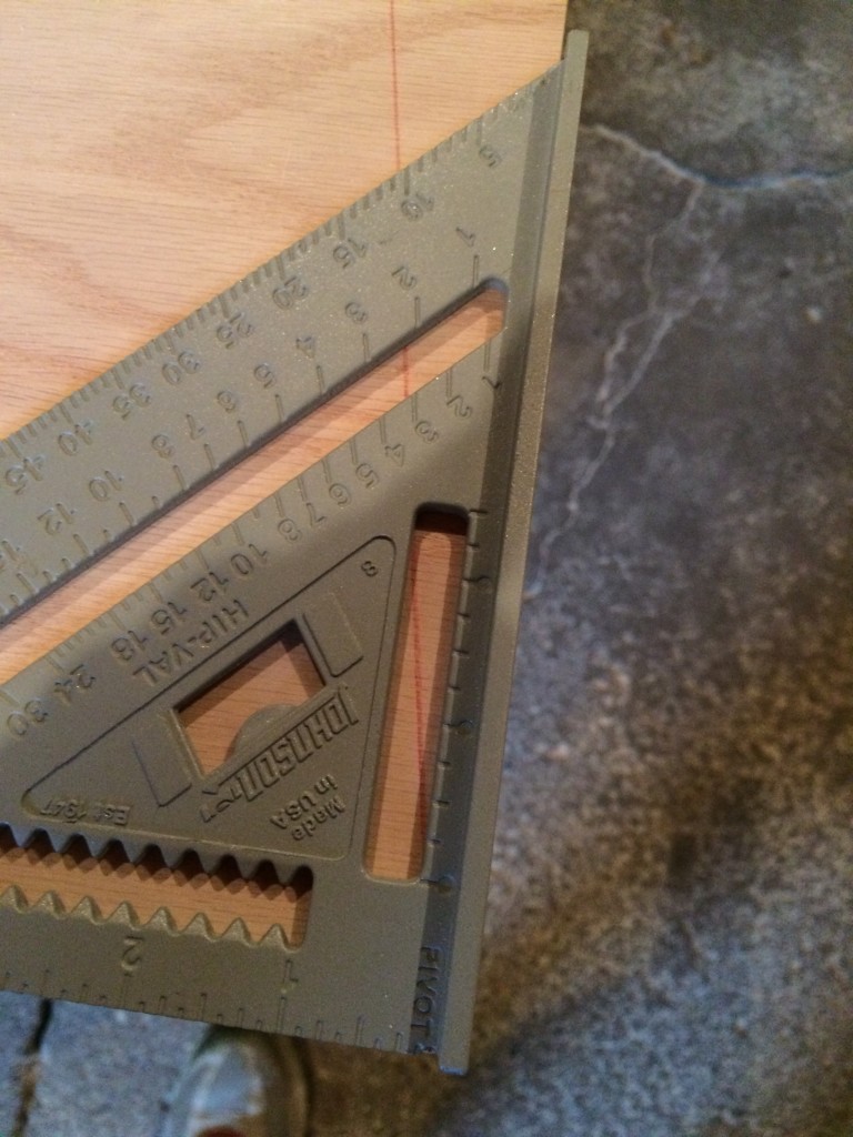
Before you read the following details, please keep in mind that I was a “C” student in math growing up (Sara has no comment regarding her Math grades). You know how when you’re in high school math, and you joke with all you friends, “When will we ever use this information?” the answer is: after you buy a 30 year old home and decide to build a series of things that attach to the settled warped walls (except for proofs – you will never in your life need to write a Geometry proof again after 10th grade, that shit is useless).  For this project, I needed to accurately calculate and mark lines to make compound miter cuts (more than one angle at one time).  The biggest cut was going to be in the corner where the seat backs met together.  I needed to take into consideration the angle that the seat on the left would bend back, and also the angle of the seat on the right for how the two pieces fit together.  I first held an angle tool up to the bench and saw that it bent back at an angle of roughly 10.5 degrees.  I marked the board using that information:

IMG_2134

Also, these photos have been brought to you by Excedrin Migraine, “Excedrin, the headache medicine.”

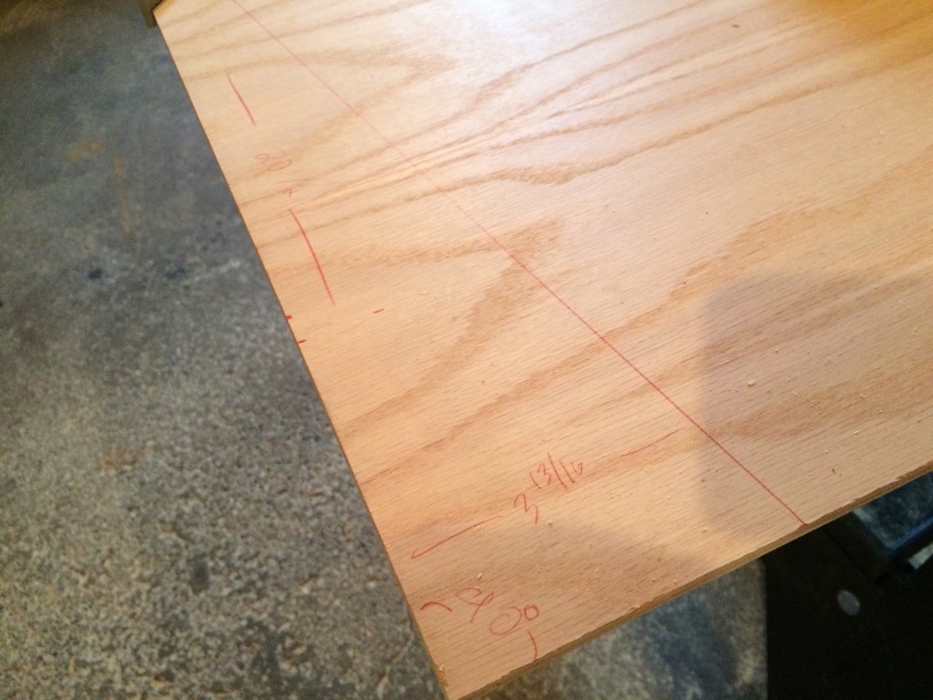
The red line on the board below shows where the cut would have been made if I didn’t take time to measure a second way.  Over such a large distance, I minor miscalculation could have devastating results and ruin a fairly pricey piece of oak plywood.IMG_2135

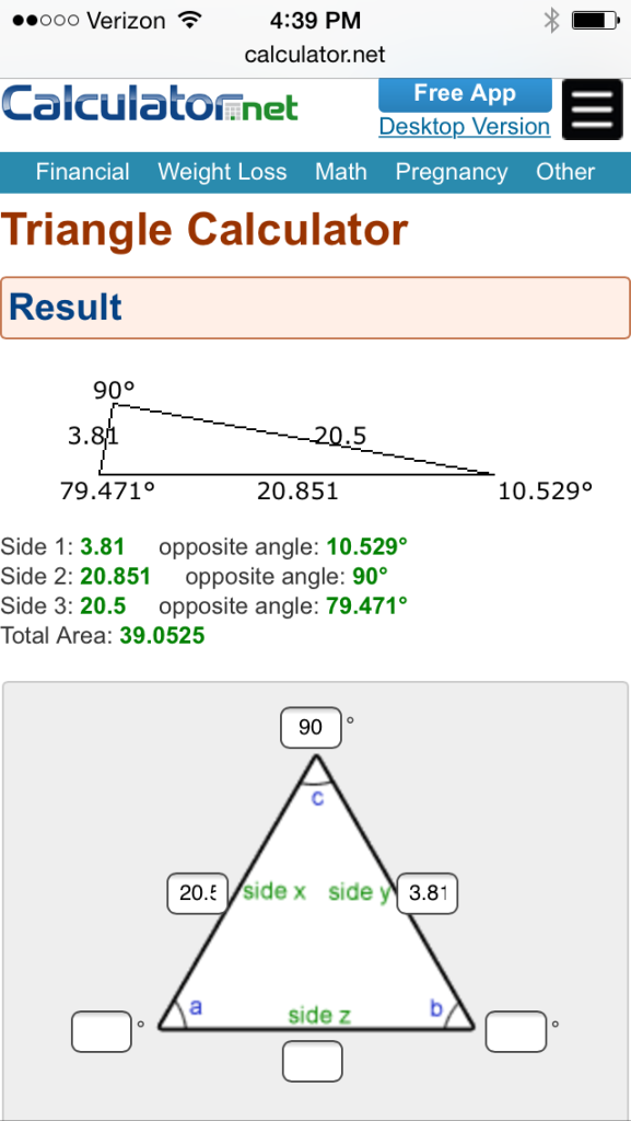
In the original plan, the seats bent back 11 degrees, which is why I was confused when the angle tool told me otherwise.  Using a tape measure, I double checked the height and width of the boards I had already cut in the dining room.  I used an online angle tool to compare the angle of 10.5 degrees I had marked with the original dimensions.  Here’s what I found:

IMG_2136

The information I entered in the bottom of this picture shows the distances I measured that would be shaved off if I continued with the 10.5 degree angle that was marked first.

There is the moment I started to scratch my head.  I knew from the original plan that the area I was dealing with had a height of 20.5 inches and a depth of four inches.  Measuring 3.81 after marking the 10.5% angle made me want to re-calculate with an 11 degree angle instead:

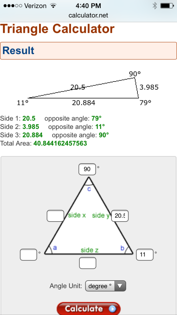
IMG_2137

I used the calculator to input angle-side-angle. 90 degrees and a bench length of 20.5 inches, and an 11 degree angle at the top.  Notice at the top of this image, the calculation that shows 3.985.  This is much closer to the original dimensions of 4 inches, so I knew this had to be correct.

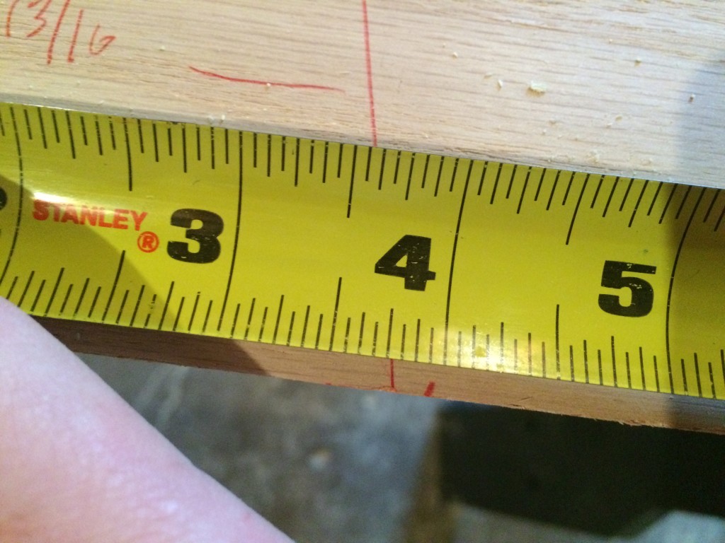
Using this different method of measuring the angle, I marked on the board where 3.985 would be.  It was about a quarter inch away from where I marked the other cut.

IMG_2138

Whew!

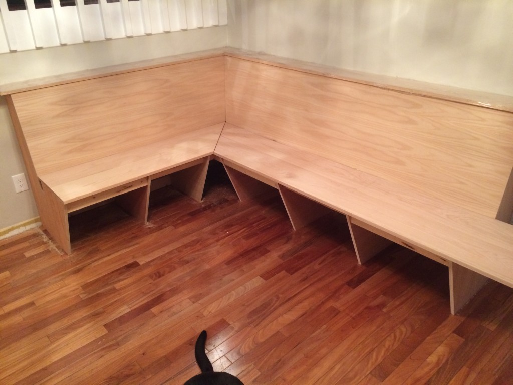
After I had that angle marked, I simply adjusted my handsaw to 11 degrees and made the cuts.  Then, the fun part.  Piecing them together:

IMG_2139

Winnie decided that her tail needed to be in this picture!

IMG_2140

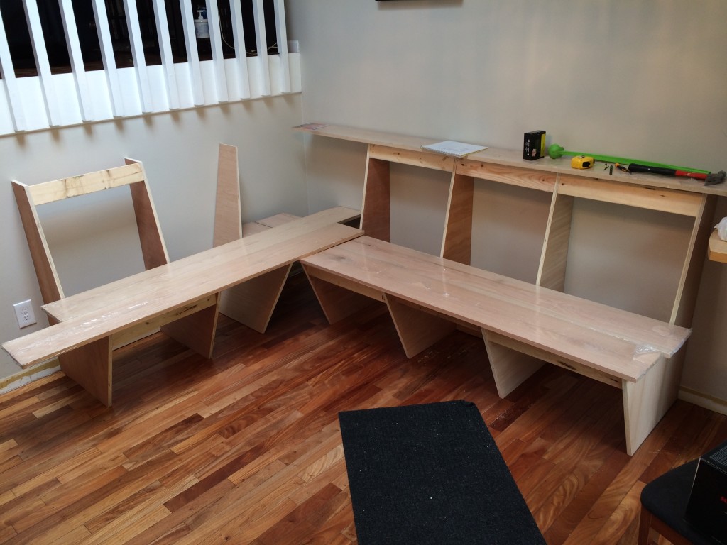
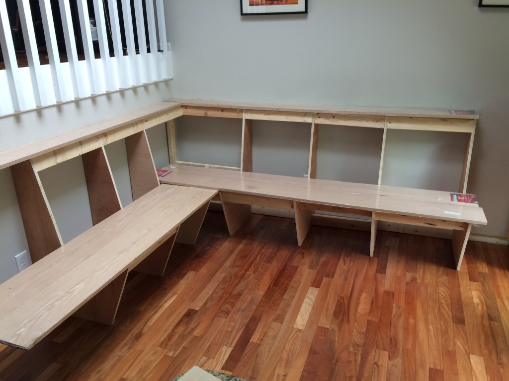
The angles have been cut for the seats.

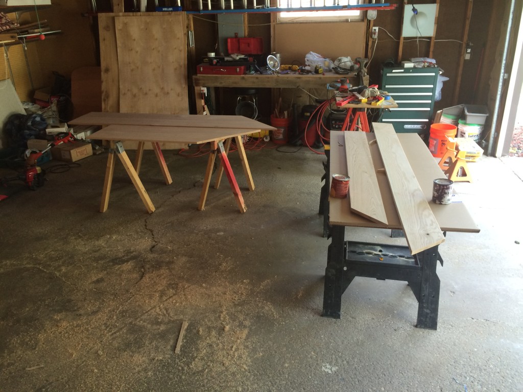
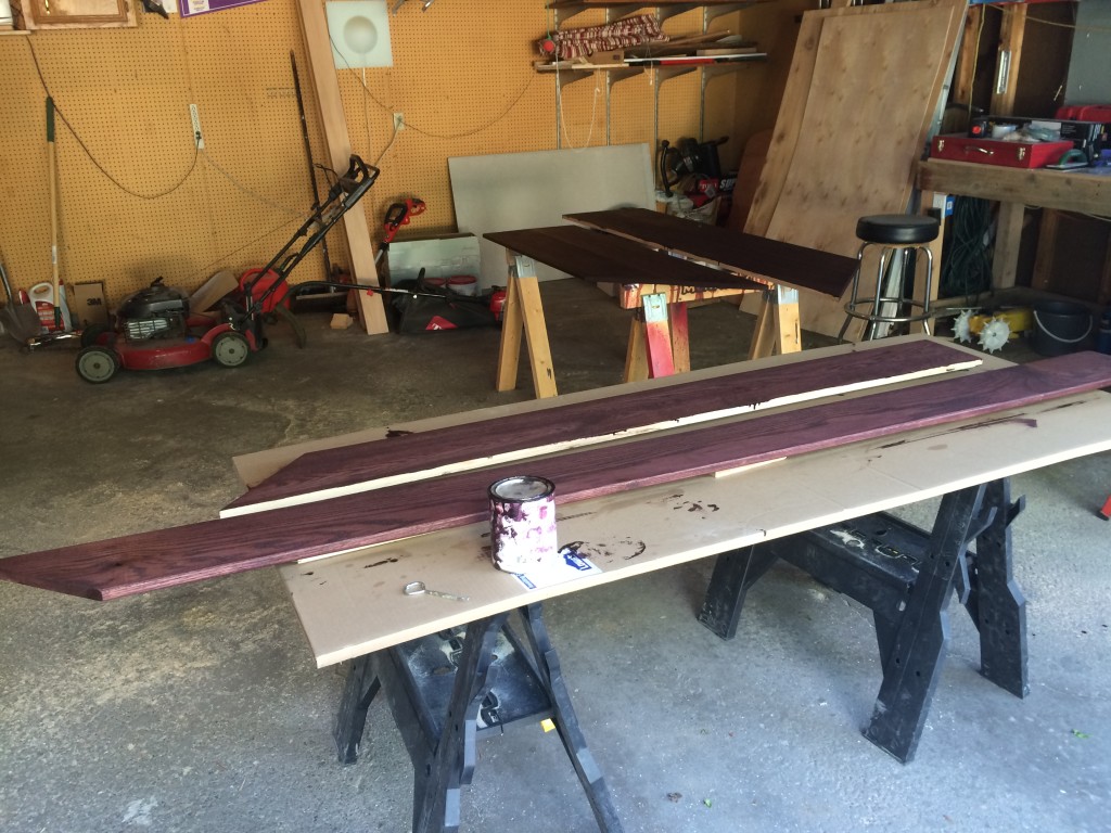
Once the wood for the seats was cut, it was time to start staining.

IMG_2202

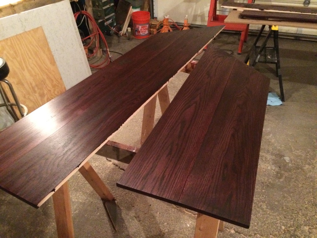
Like previous projects, we used a Cabot Black Cherry wood stain.  We wanted to continue the theme of dark stain and white paint that was used in previous permanent projects in the house.

IMG_2203

The boards were secured from beneath with 2x4s so no nails or screws would be visible from above.

IMG_2206

I love this part, you can finally see a banquette coming together.

IMG_2234

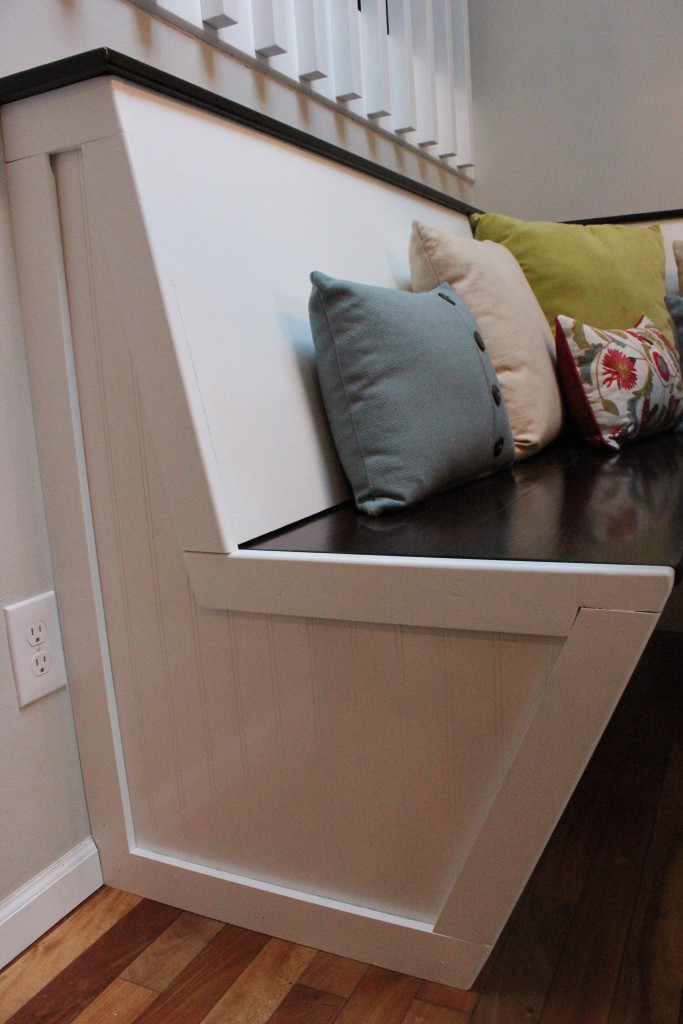
For the sides of the banquette, we went with a pre-finished decorative wood paneling and poplar wood for the trim.  I used a router to leave space for the plywood to fit beneath the trim pieces and also to give the trim a beveled edge around the sides.

IMG_3434

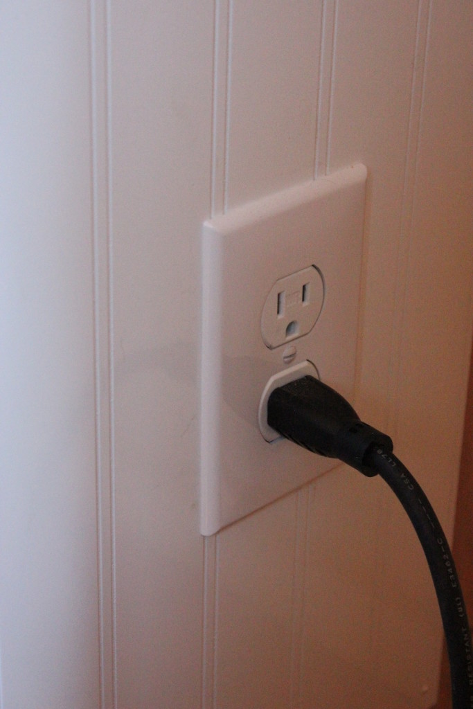
On the right side of the banquette, I installed an electrical outlet to plug in the microwave.  It is essentially a glorified extension cord with a fancy face plate, with a plugin on the inside of the banquette connected to the existing wall outlet.IMG_3435

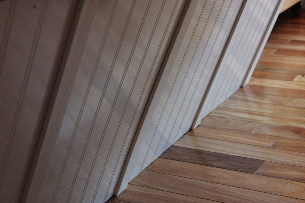
For the base of the banquette, we used the same decorative plywood, but went with vinyl trim pieces to give it a finished look.IMG_3436

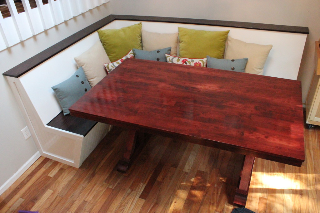
Here’s what we’ve all been waiting for (this includes every friend/family member we’ve had over in the last two years that we invited to eat with us in the living room).  After a few throw pillows and a new table (that’s actually a dining table and not a desk), we have a place to eat our meals and entertain guests!

IMG_3426

Adulting like pros, no longer eating at an Ikea office desk.

Edit: Now that this is all put together, we’re seriously considering painting the entire banquette white (i.e. not having the top and seat stained). But that’s another project for another post.